NeXT Computer fonts
Many of the WorldWideWeb browser’s fonts were inherited from what was available on NeXTSTEP operating system. This was a time before vector fonts; each font style was drawn as pixels for each desired font size. NeXTSTEP had 3 main fonts: Helvetica, Courier, and another monospaced font called Ohlfs. These were available in several different sizes in regular, bold, and oblique.
The default styles for the WorldWideWeb browser made use of Helvetica and Ohlfs. Ohlfs was created by designer Keith Ohlfs and was never replicated outside of the NeXTSTEP.
For our WorldWideWeb rebuild project, was wanted to make the experience of using the browser as close as possible to the orignal. So one major limitation was that we couldn’t use modern versions of these fonts. That’s because modern fonts are vector based and scale smoothly at any size. This made the experience feel much more polished than it was in 1989. Our solution was to create modern fonts that looked like they were bitmap fonts from the late 80s.
On a NeXT machine loaned to us from CERN, we wrote out the alphabet in HTML so we could see all the different font variations and sizes. Using “Grab.app” we took a screenshot and sent the tiff files back to our own machines to use modern tools to replicate the look.
We dutifully traced each square pixel in a vector program, which was imported into a font creation tool and exported in a format suitable for the web. The result was a modern vectorised 1989 bitmap-like font which completed the look of the emulation.
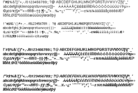
We ran into a few curious anomalies between 1989 hardware and today. When we took a screenshot it rendered the screen as a data file where each pixel is a square. However, when rendered on the NeXT CRT "Megapixel" monitor, the width of each pixel is actually wider than it is longer. A screenshot doesn’t capture this, it is an aspect of the hardware. The font we created is “correct” and if it were viewed on the NeXT machine it work look perfect, but pixels on our modern LCD monitors are square.  This old character set did not include a full Unicode set of characters. Many of the common accented characters were only available in uppercase.
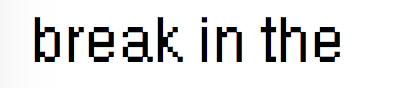
One issue we ran into is that the pixel size on the original NeXT monitors wasn't quite square. As an example, compare the following. This image is of the font on the NeXT monitor:
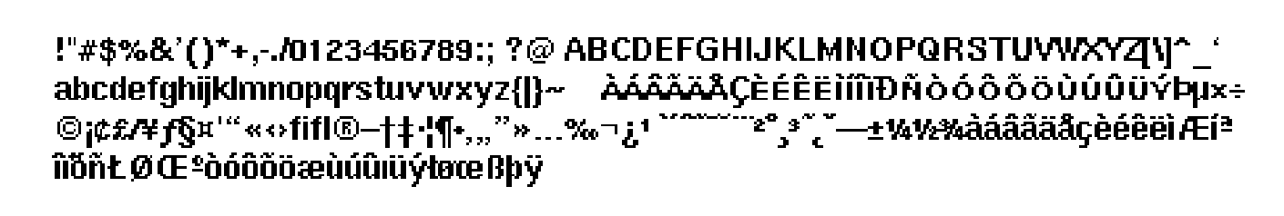
This is as rendered on a contemporary machine:
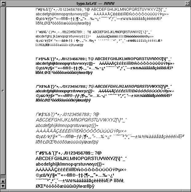
And here's our finished character set: